There’s nothing more disheartening than spending hours digitizing a design, only to watch it stitch out as a puckered, distorted, or thread-bare mess. These failed projects can feel like a waste of time and expensive materials. The good news is that most embroidery failures are not random. They are the result of a few common, and entirely avoidable, digitizing mistakes.
Understanding these pitfalls is the key to transforming your embroidery from frustrating to flawless. This guide will break down the 12 most common errors new digitizers make and provide clear, actionable solutions to ensure every project you create is a success.
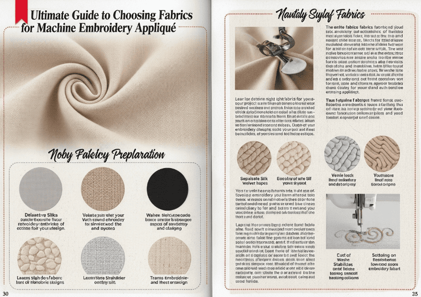
Mistake 1: Ignoring the Fabric Type
One of the most frequent errors is creating a one-size-fits-all design. A design digitized for sturdy denim will be a disaster on a stretchy t-shirt. Different fabrics have unique properties of stretch, weight, and texture that directly impact how they react to stitches.
- The Problem: Ignoring the fabric can lead to severe puckering, where the fabric bunches up around the design, or distortion, where the design itself looks warped. Using stitch settings meant for a stable woven on a delicate knit fabric will almost always result in a poor-quality stitch-out.1
- The Fix: Always consider your fabric first. For stretchy knits, use less dense stitches and a proper stabilizer. For high-pile fabrics like towels or fleece, ensure you use an underlay to prevent stitches from sinking into the nap.1 Modern software like PE-Design 11 includes a “Fabric Selector” tool that automatically adjusts stitch attributes based on your chosen material, taking much of the guesswork out of the process.
Mistake 2: Incorrect Stitch Density
Stitch density refers to how close together the stitches are. Getting this wrong is a recipe for trouble.
- The Problem: If the density is too high, you create a stiff, “bulletproof” design that feels like a patch of cardboard. This can cause the fabric to pucker, warp, and even lead to frequent thread and needle breaks due to the strain on the machine.1 If the density is too low, the design will look sparse and gappy, with the fabric showing through.
- The Fix: Adjust stitch density based on the fabric and the size of the area being filled. Thicker fabrics can handle higher density, while delicate fabrics require a lighter touch. A good starting point is to aim for a balance where the coverage is solid but the fabric remains flexible.
Mistake 3: Forgetting or Misusing Underlay
Underlay stitches are the unsung heroes of quality embroidery. They are a foundation of stitches sewn before the main design, and their role is critical.
- The Problem: Without a proper underlay, the top stitches can sink into the fabric, resulting in a design that lacks definition and looks messy.1 This is especially true on textured fabrics like fleece, terry cloth, or corduroy. Overlooking the underlay can also lead to poor registration, where outlines don’t line up with filled areas.1
- The Fix: Almost every design element, especially fills and satin stitches, needs an underlay. Common underlay types include an edge run (for borders), a zigzag (for satin columns), or a light grid fill. The underlay stabilizes the fabric and provides a smooth, raised surface for the top stitches to sit on, ensuring a crisp, professional finish.1
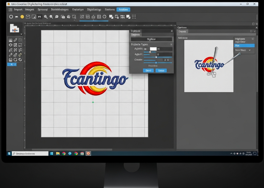
Mistake 4: Poor Pathing (Inefficient Stitch Order)
Pathing is the route the machine’s needle takes to complete the design. An illogical path creates a host of problems.
- The Problem: Inefficient pathing results in a mess of unnecessary jump stitches (long threads between two design elements) that must be manually trimmed later.3 This not only looks unprofessional but dramatically increases production time. A poor stitch order can also cause registration issues and unnecessary fabric distortion.2
- The Fix: Plan your stitch path logically. A good rule of thumb is to digitize from the center of the design outwards, which helps push any fabric distortion to the edges.2 Group objects of the same color together to minimize thread changes. Good pathing aims for a smooth, continuous flow with as few trims as possible.3
Mistake 5: Making Text Too Small
There is a physical limit to how small you can embroider text and still have it be legible.
- The Problem: Text that is too small will turn into an unreadable blob of thread. The needle and thread have physical dimensions, and they simply cannot create the sharp detail needed for tiny letters.1
- The Fix: As a general rule, embroidered letters should be at least 5mm (about 1/4 inch) tall. The columns of the letters should be at least 1mm wide to allow for a clean satin stitch.1 When in doubt, always go slightly larger. Using fonts specifically designed for embroidery will also yield much better results than converting standard computer fonts.
Mistake 6: Using the Wrong Stitch Type
Embroidery digitizing relies on three core stitch types: the Running Stitch, the Satin Stitch, and the Fill (or Tatami) Stitch. Using the wrong one for the job is a fundamental error.
- The Problem: Using a Fill Stitch for a thin border will look bulky and undefined. Trying to fill a large area with a Satin Stitch will result in long, loose stitches that are prone to snagging.4
- The Fix: Match the stitch to the shape.
- Running Stitch: Use for outlines and very fine details.5
- Satin Stitch: Use for borders and lettering between 1mm and 10mm wide.4
- Fill/Tatami Stitch: Use for filling large, solid areas of color.4
The Final Checks: 6 More Mistakes to Avoid
Beyond the foundational errors, several other missteps can compromise your final product.
- Not Using Pull Compensation: Stitching physically pulls fabric inward. Pull compensation makes stitches slightly longer to counteract this effect, preventing gaps from forming between adjacent colors.7
- Incorrect Thread Tension: While often a machine setting, tension problems can be made worse by a design that is too dense, leading to thread breaks and loops.
- Scaling Stitch-Based Files: You cannot resize a final machine file (like a.PES or.DST) by more than 10-15% without ruining it. Doing so either creates gaps or a dense, stiff mess.8 All resizing must be done in the original, object-based software file.9
- Starting with Low-Quality Artwork: Digitizing is not magic. A blurry, low-resolution image will produce a blurry, low-quality embroidery design. Always start with the clearest, highest-resolution artwork possible.
- Wrong Fill Direction: The angle of your fill stitches can dramatically change the look of a design. A fill direction that fights the shape of the object can look unnatural and cause light to reflect poorly off the thread.10
- Skipping the Test Stitch-Out: This is the most critical mistake of all. No matter how perfect a design looks on your computer screen, you must always sew a test sample on a scrap of similar fabric before embroidering on your final garment.10 This is the only way to catch errors and see how your digital settings translate to real-world thread and fabric.
H2: Frequently Asked Questions (FAQs)
Why is my embroidery puckering?
Puckering is most often caused by a combination of factors: the fabric was not stabilized correctly, the stitch density is too high for the fabric type, or there is a lack of proper underlay. Ensure you are using the right stabilizer for your fabric and that your design’s density is appropriate.2
How can I make my embroidered text look cleaner and more readable?
To improve text clarity, ensure your letters are large enough (at least 5mm high). Use a font designed for embroidery, as they are created with stitch limitations in mind. Finally, make sure you are using a Satin stitch for the letters, as it provides the cleanest finish.1
Can I just use my software’s “auto-digitize” feature?
Auto-digitizing can be a great starting point for very simple, clean graphics. However, for most designs, especially those with any complexity, manual digitizing will produce a significantly higher-quality result. Manual digitizing gives you full control over pathing, stitch types, and density, which are crucial for a professional finish.